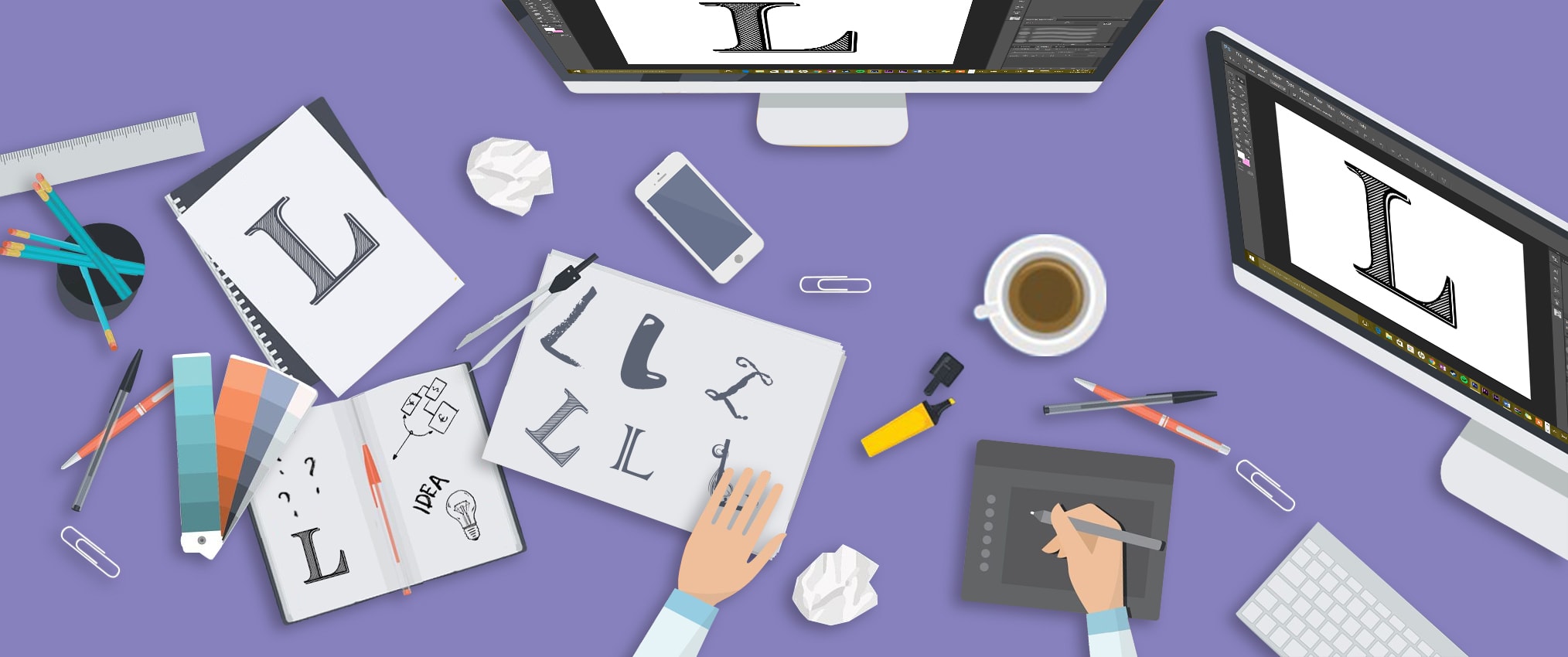
Logo designing is a highly creative job that requires a smart artist who can use the best technology to create a logo that reflects the true image of the brand. The logo will soon become the identity of the brand and hence ample care should be taken while designing the same. Logo creation is not only about creativity, it has a lot to do with understanding the target market, understanding what the company does and its image among the potential customers. Technology also aids in logo creation to a great extent. A competent company that is experienced in logo processing India will consider the following points while designing the best logo for each of its clients.
1) �Keep the design Simple
A simple design is easier to remember and connect. Take for example Apple Inc�s design. It�s an epic. The image itself is the company�s name with a slight tweak. Even a kid can recognize it and that�s very important to stay popular in the market. That�s where Offshore Outsourcing Services come handy, in aligning the design to the local culture.
2) Mind your Typography
Typography or the font, its size and color used are very important in a logo. Use fonts that relate to the brand name and image. A feeble or thin font used for a gymnasium may not be appreciated. The logo designing services India suggests that the font must reflect the image of the brand.
3) Make good use of colors
Colors make a huge difference to how your logo is perceived. The logo�s color should match the company�s image and what the product is doing. For example, if you have a brand that promotes Go Green, making a red logo does not make sense. You have to make use of the color green smartly in the logo. Similarly, you have to keep in mind, the target customer�s emotions. For children�s products, brighter colors are usually used. For formal products and services, subtle colors or black will do well.
4) Align the logo to customer sentiment
The logo should reach the customers positively. This is an important aspect of designing logo. The designer should think beyond the visual marvel being created and understand how it would be taken by the intended audience. This is an advantage you get when you Outsource logo design services. Since every brand would want to reach out to maximum audience, something commonly appealing should be considered.
5) Make smart use of the Negative Space
One classic example of positive use of negative space in a logo is given with the FedEX logo. The space between E & X in the logo creates an arrow which indicates move forward. That�s a brilliant way to use the negative space. Another interesting example is Amazon�s logo. The arrow from A to Z subtly indicates that it deals literally everything from A to Z. Similarly, you can make use of Image Processing Services India to create logos that make smart use of negative space.
6) Alignment matters
On alignment, people may have different opinions. Most of the people find well-aligned logos more appealing. But there are cases where alignment does not matter at all. The logo of Micromax is an example. Those opting for unaligned logos find that it is easily noticed by people because it is not well-aligned. But there�s always the risk that people get irked by such logos.
�